You may have noticed that it’s been unnaturally quiet around here. There’s been a dearth of new feature announcements, tweets, blog and Facebook posts, etc. What’s going on?
Hiveword newsletter subscribers know what’s going on. Be sure to subscribe to the newsletter if you want the freshest news.
I suppose the title of this post is a spoiler but today I’m going to talk about the long overdue Hiveword redesign. What follows is the content from a past newsletter describing the changes.
In the last newsletter I mentioned the Hiveword redesign that is underway. In this edition I have some screenshots for you!
My goal with the redesign is to make Hiveword prettier, mobile-ready, streamlined, and more amenable to adding new features without having to bolt things on like some sort of novel organizer Frankenstein.
Let’s consider the scene page. In Hiveword, the scene is THE central component and where I suspect that most people spend the majority of their time. Here’s how the scene page looks today:
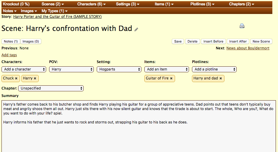
Ouch. That’s what you call a screen only a design-challenged programmer could love. To its credit, it is easy to figure out how to use, busy though it may be.
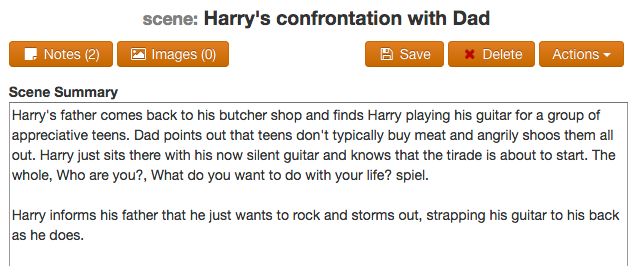
Here’s the new scene page:

Now, you won’t mistake this page for something designed by Apple but I hope you’ll agree that it’s considerably easier on the eyes. Plus, there are some huge changes here. The screen is now divided into three sections: story navigation, core details, and metadata. Let’s look at each of these in turn.
Story Navigation Section
In the current Hiveword design, the story navigation is presented horizontally at the top. There is no room for expansion. If you’re a Hiveword Plus user you’re blessed with a SECOND level of navigation as seen in the first screenshot. This needed fixing. Desperately.
Here’s the new story navigation section:

This section will appear on all story component pages such as scenes, characters, etc. The vertical orientation provides room to grow. Plus, the sections stay open between pages however you have them set.
For Hiveword Plus users, your custom types are now seamlessly embedded in the story navigation. In the screenshot, Spells is a custom type and Patronus is a definition of a spell.
Because each item is a link it’s easy to get to wherever you need to go. The little list icon in the section headers takes you to the list page of that thing (such as the scenes list page).
Main Section
The next section contains the fields for the story component (i.e., scene, character, etc.).
The main section offers a much cleaner look and is straightforward. The Save and Delete buttons do what you’d expect. Notes and Images are Hiveword Plus features and will work like before. That is, they’ll pop open in their own embedded sections of the page. You can change the scene name by clicking on it. This is also the same as the existing design.
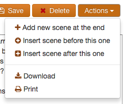
Miscellaneous functionality is now in the Actions dropdown:
Metadata Section
Finally, we come to the third section which is component metadata:
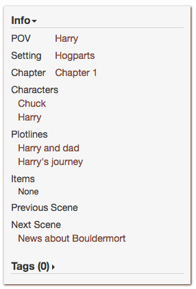
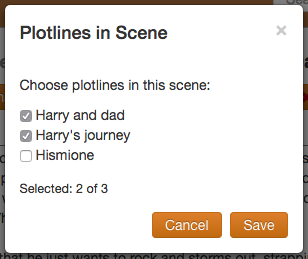
There’s a lot of scene metadata since scenes are so important. The other story components won’t have so much information. But, again, you can see that things are now vertical which allows for expansion. Plus, choosing the POV, setting, and characters in the scene is now much easier and requires less clicking. For example, click on the Plotline section and you’ll get a popup which makes selection easy:
The other bits of metadata work the same way.
Mobile
I’ve mentioned multiple times that going vertical helps with usability and expansion. It also helps immensely on mobile devices since they don’t have enough space to accommodate wide horizontal menus. With the new design, the left and right sections will auto-hide when there’s not enough screen real estate like this:

Simply click on the arrows to slide in the section and then dismiss it when done.
I’m really excited about this redesign because not only does it look better but it gives Hiveword room to grow in terms of both visuals and technology. Unfortunately, I can’t tell you when the new design will be available because, well, I don’t know. 😉 There is SO much to do…
So, there you go. Now you know that there’s a huge redesign effort underway.
Do you like what you’re seeing so far? Any wishes or other feedback? Hit me up in the comments below or via the various other methods you can find here.
Time for me to get back to work!

Hey Mike,
Just checking in to see when the new update is going live?
This is fantastic! I can’t wait to use it, now, and it’ll be even easier to sell my author friends on Hiveword 🙂
Clearly these are great improvements.
I’ll be tellingly Writer’s Group friends about your site.
Bob
Thanks, Bob!
Comments are closed.